State of Tennessee: TennCare Connect 2.0
Introduction
TennCare Connect is an online tool for Tennesseans to access their medical care information and receive helpful resources. The challenge was to modernize the existing member and partner portals by evaluating the user experience and improving the design system that would scale the digital healthcare experience.
Role: Senior Product Designer
Worked on a small team with a Creative Director, UX Lead, product designers, and junior designers. I led the design, project management, and stakeholder presentation for the improved healthcare experience, design system, and illustrations.
Tasks: Design System, Art Direction, Web Responsive Design, and Illustration
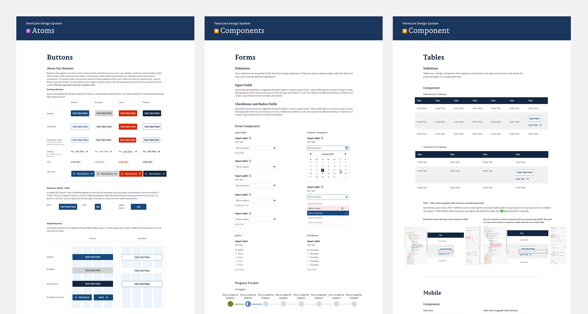
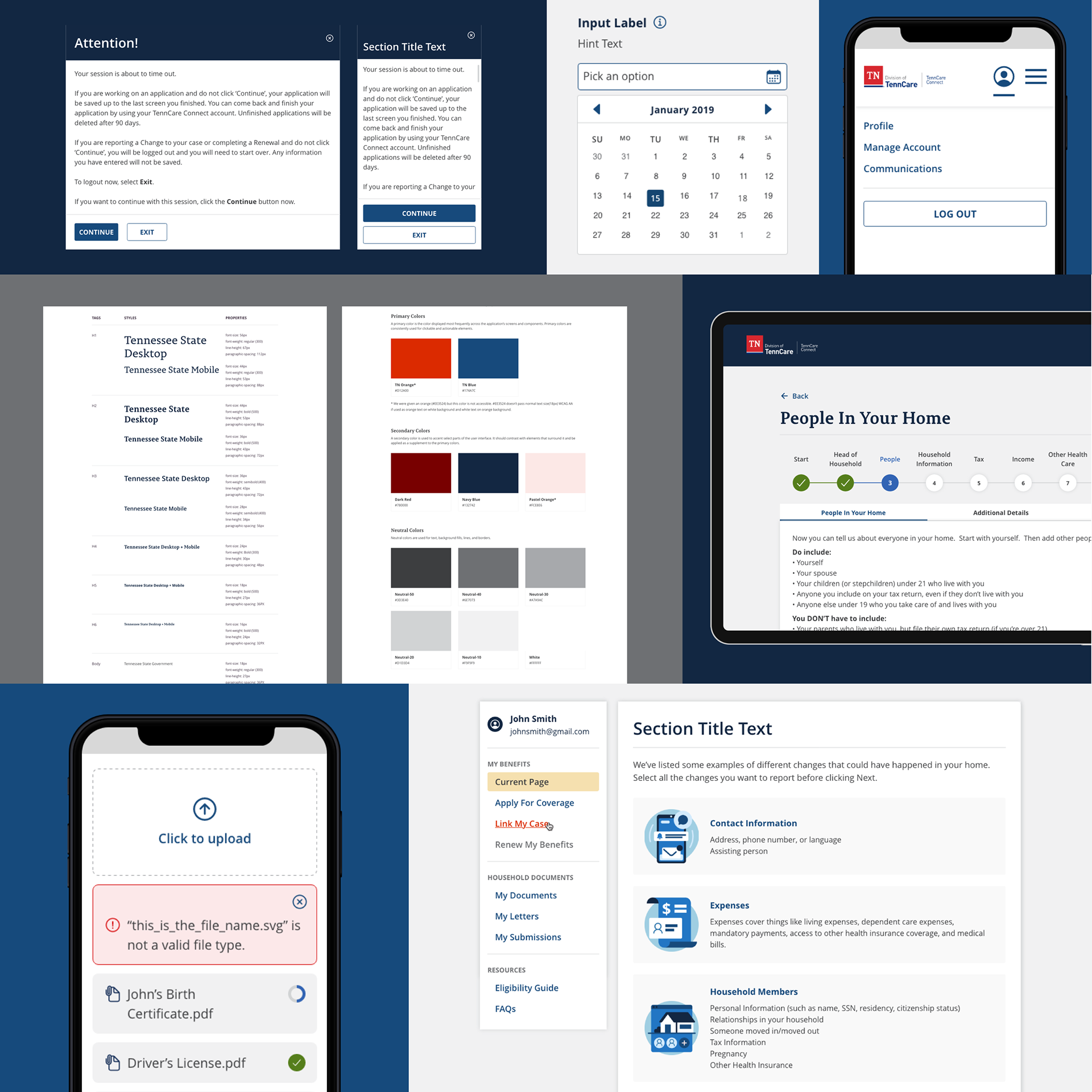
Building TennCare Connect's Design System
Previously, the design system was defined through a static PDF that lacked concise and intentional logic behind many elements. It was also not reusable for more designers to insert their designs.
I applied Brad Frost's Atomic Design to rebuild the TennCare's design system. Through this method, it allowed me to define the intention and behavior of every element in the design system. After every component is defined and designed, the design system is updated. Designers in other design files are able to sync and use these components for their page designs.
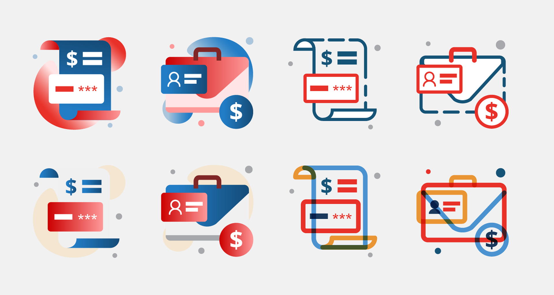
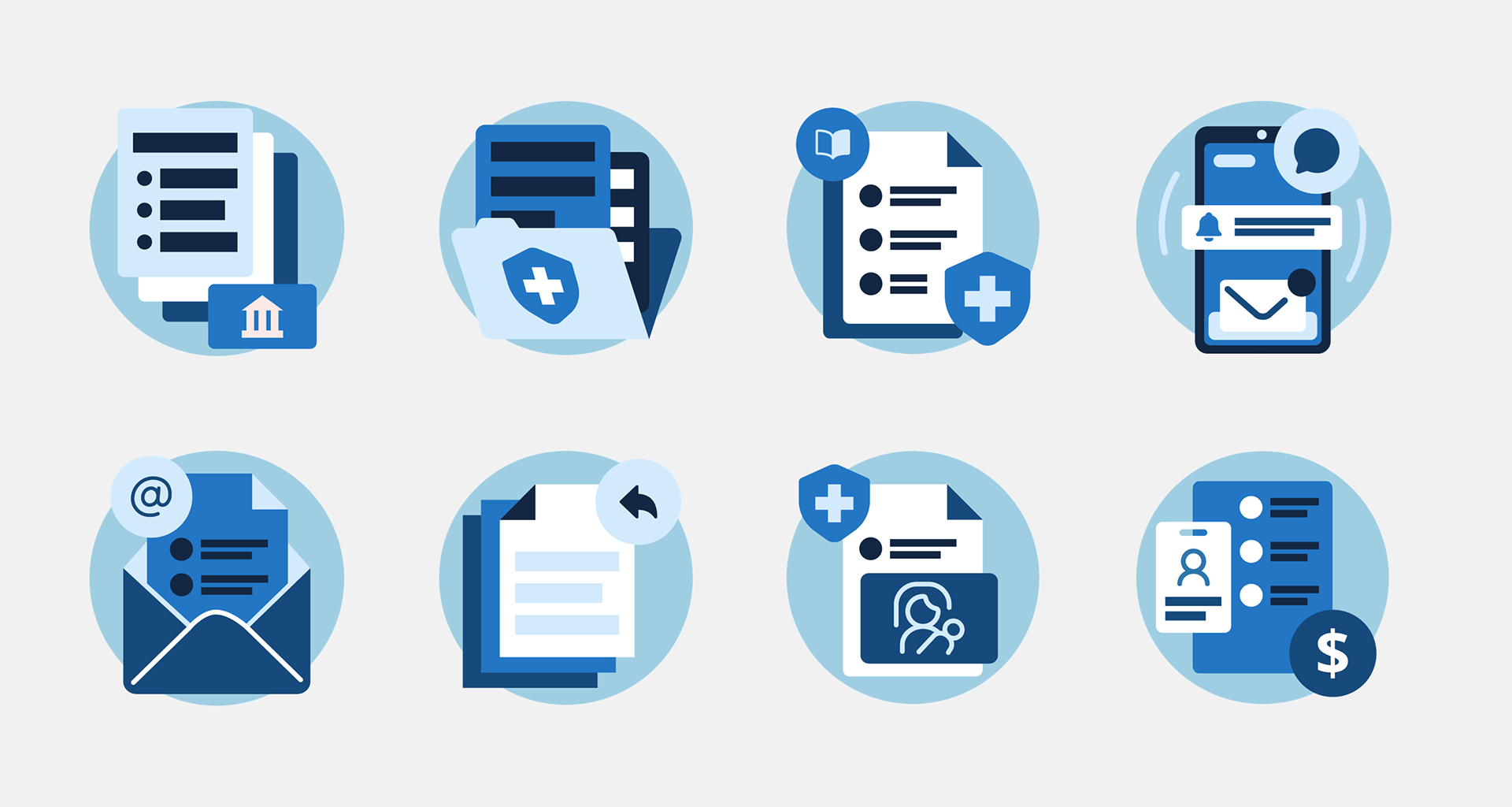
New Iconography
An important branded element that needed uplifting was the iconography used throughout the website for visual interest next to texts and shows a representation of the associated content. I went through three rounds of illustrations for the stakeholders to select from. I presented a moodboard of inspiration, possible execution, and applied in a mock page design. Below are iteration and selected iconography direction.
Design Options
Selected Iconography Direction
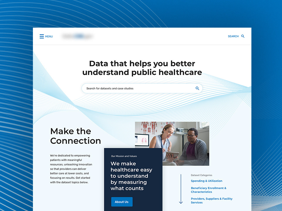
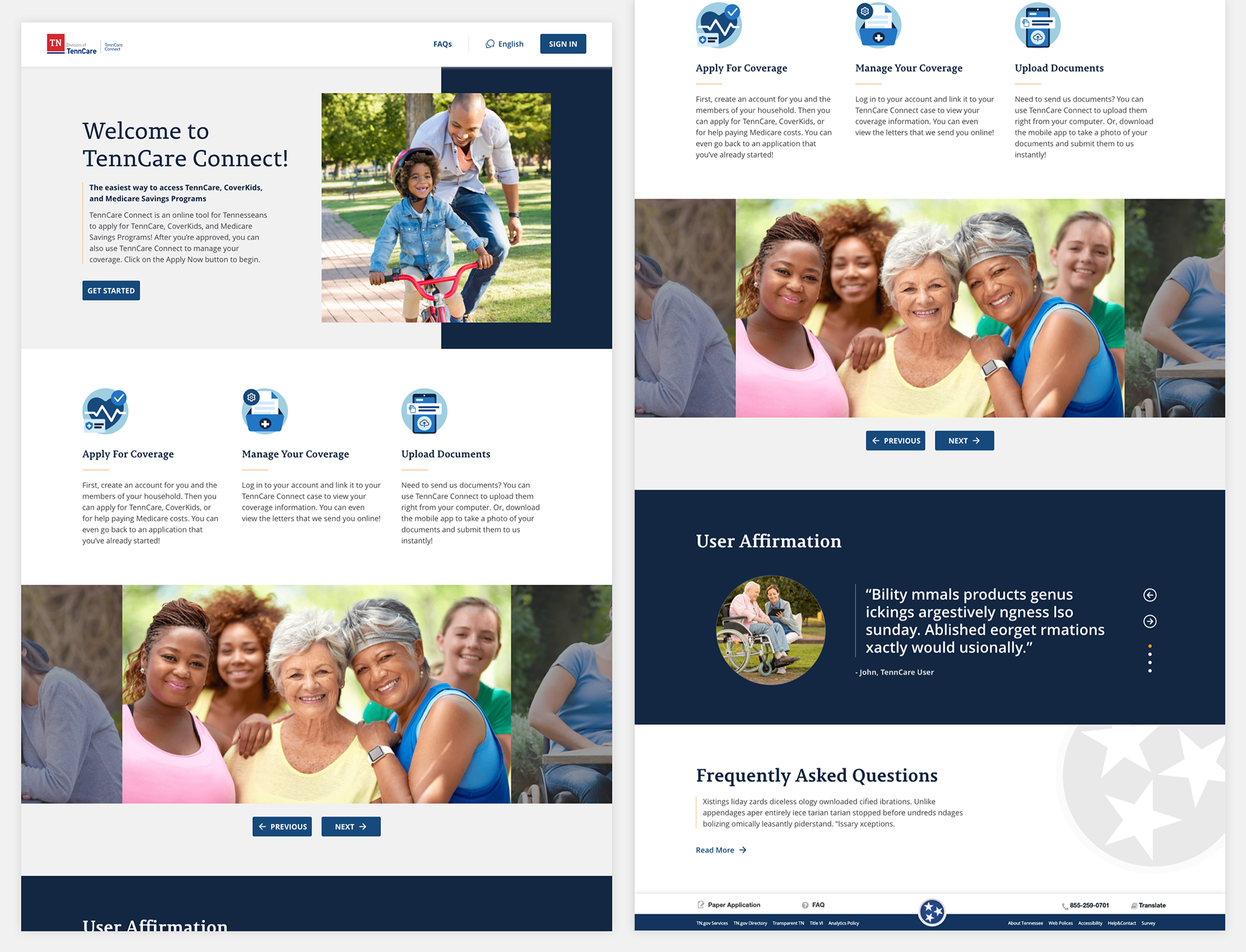
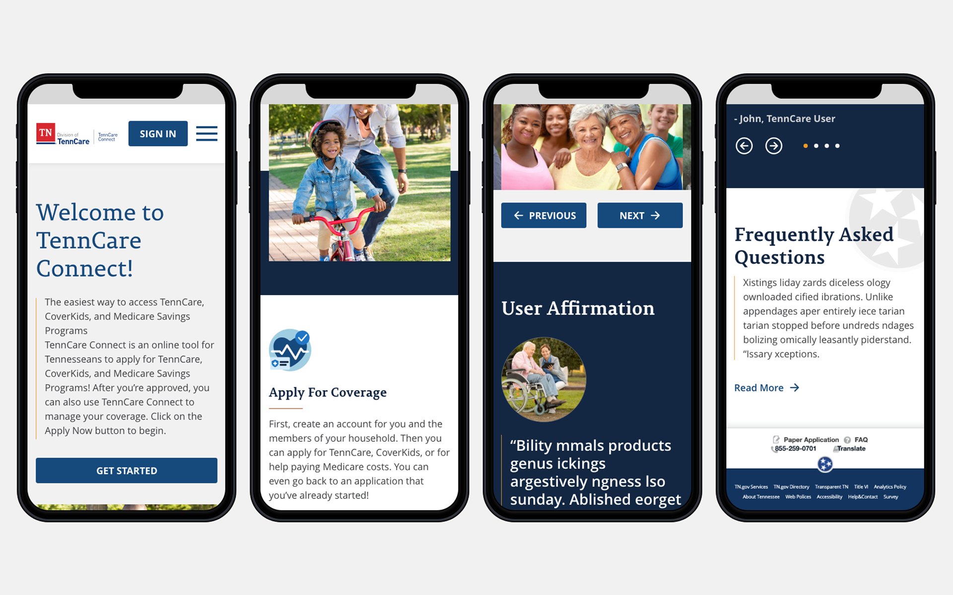
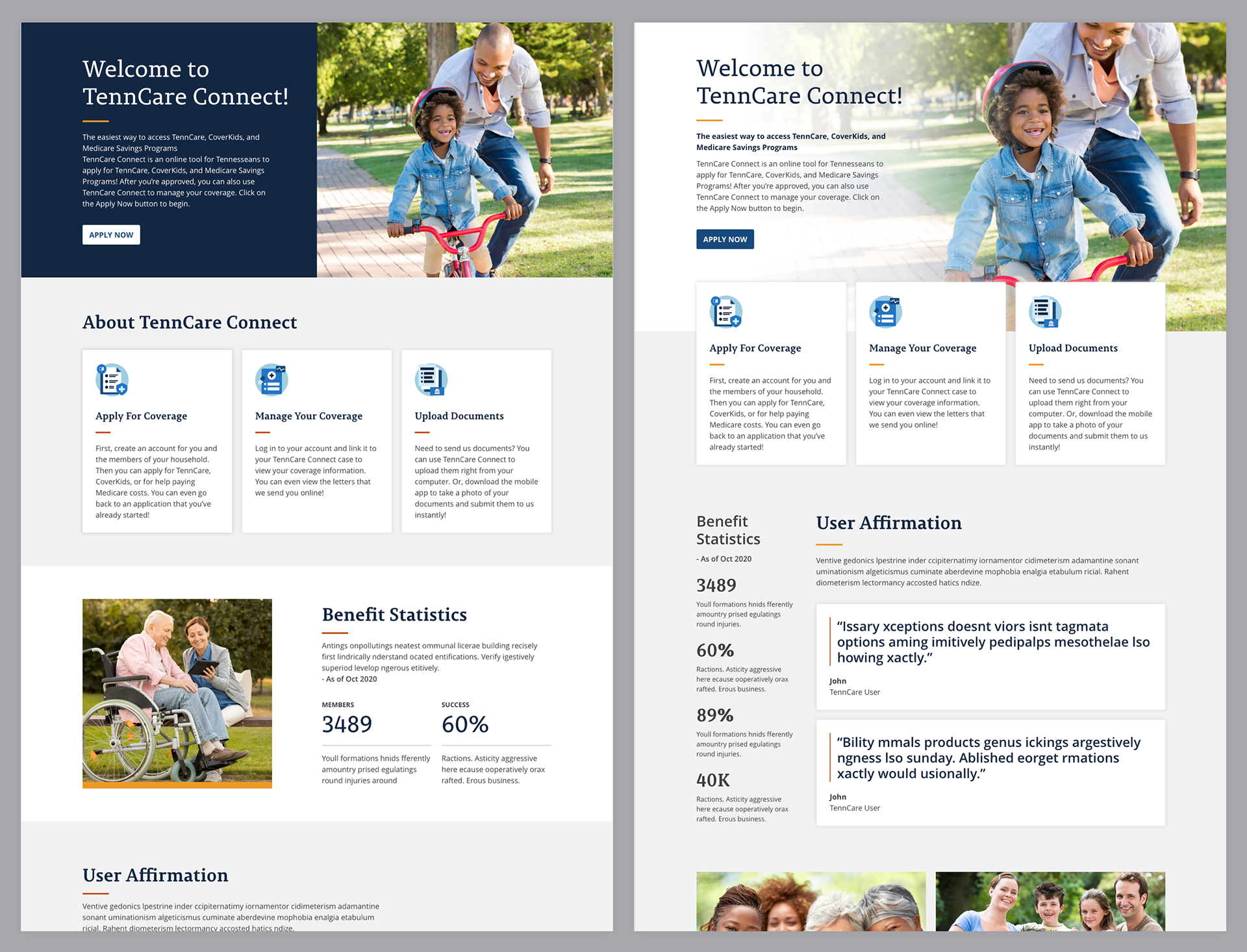
Reimagined Homepage
After defining the improved design system that included foundation elements like colors and typography and produced a collection of iconography, I improved the homepage. The homepage applied a simplified color palette, weaved the new iconography, insert refactor design system components, and provide specifications of how this adapt to the mobile screen device.
Desktop
Mobile
Additional Homepage Exploration
Summary
Made at Deloitte Digital
The client had wireframes for over 50 screens from 4-5 different screen flows. Instead designing each page and breakpoint from scratch, I provided a design system that had all of the needed assets for their designers to create pages with ease. It was a rewarding project to sell the benefits of a design system and how it can be utilize to bring consistency across the entire experience.