Homefront Solutions
Challenge
Formerly known as Transcom, Homefront Solutions is the re-imagination and privatization of the entire process of Permanent Change of Station for the US military's Transportation Command (TRANSCOM).
The Deloitte team is serving as the driver of the central products that will enable a seamless, customer-centric vision that puts control of a service member's move in the palm of their hand.
Role: Senior Product Designer
Solution
Redefining the relocation experience for service members and their families by designing a product for the responsive web, native iOS, and Android platforms. Military service members are able this product schedule a move to relocate, manage their personal account, and make claims of issues that occur during the moving process.
Tasks: Responsive Web Design, iOS + Android, Design Systems for Web + Mobile Platforms, Illustration, Sketch to Figma Migration, Design Quality Assurance, and Mentoring Designers.
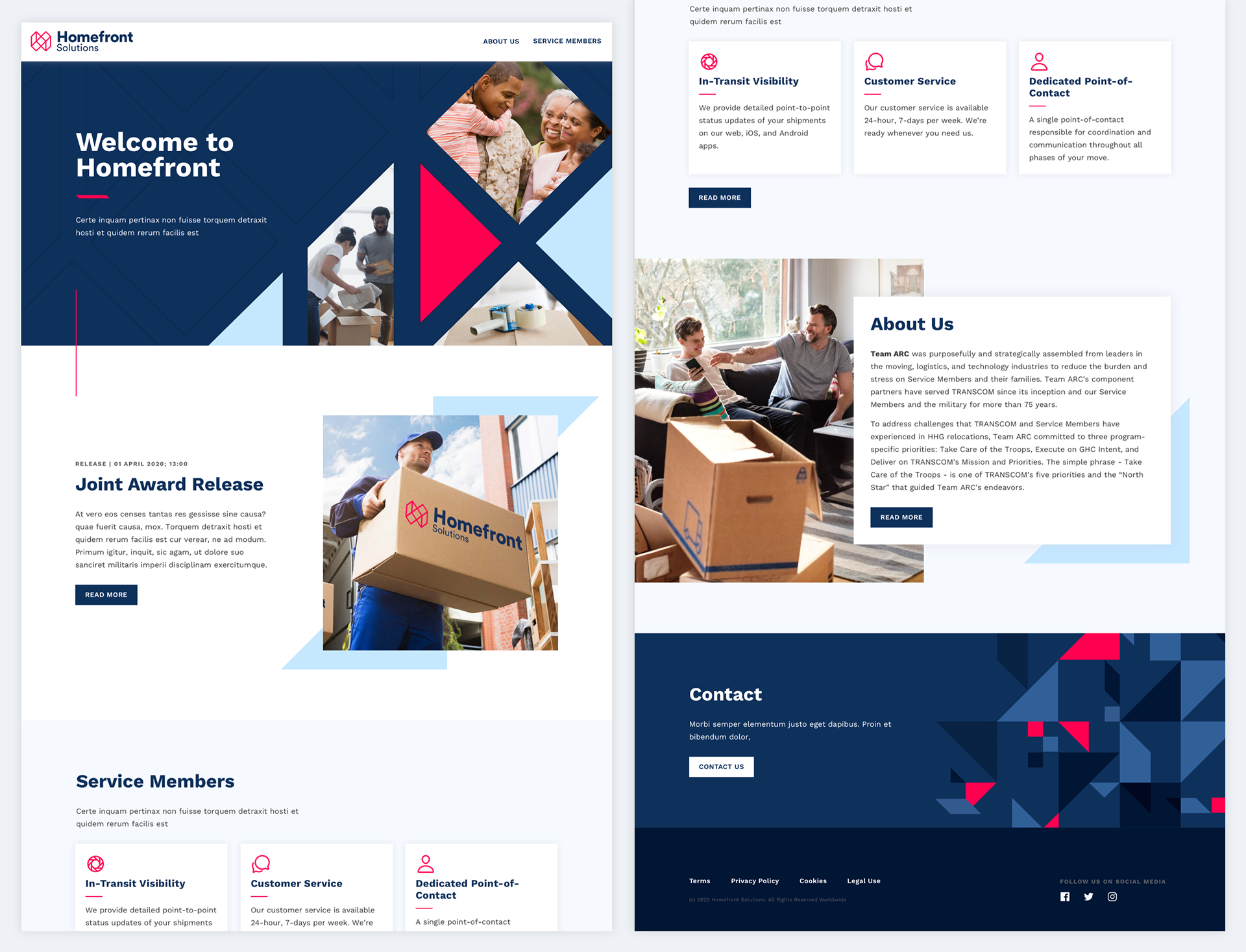
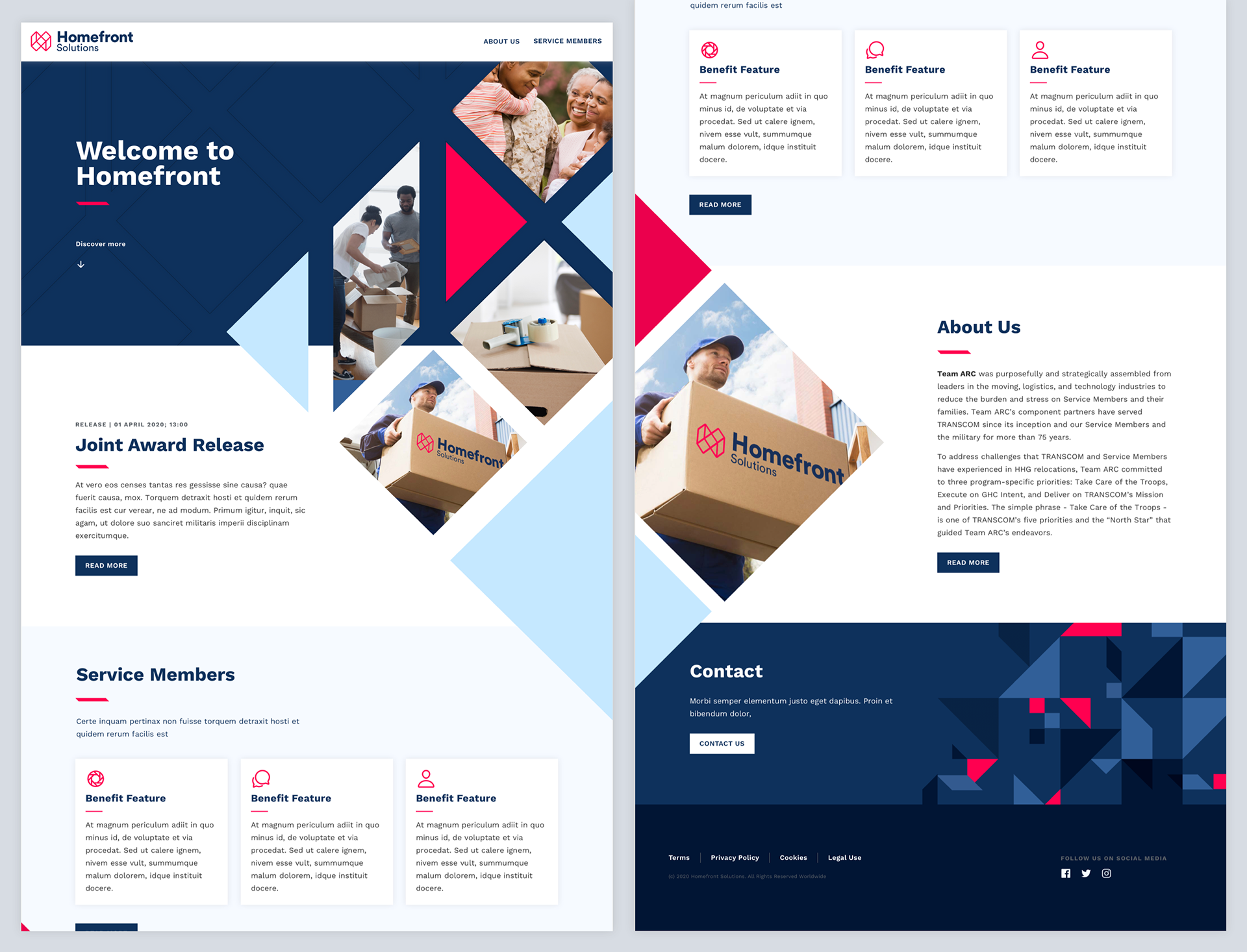
Microsite Homepage
This microsite is a public-facing to announce the partnership between Deloitte, TRANSCOM, and all of the partner companies involve. This short website states what are the capabilities and features offered to military service members.

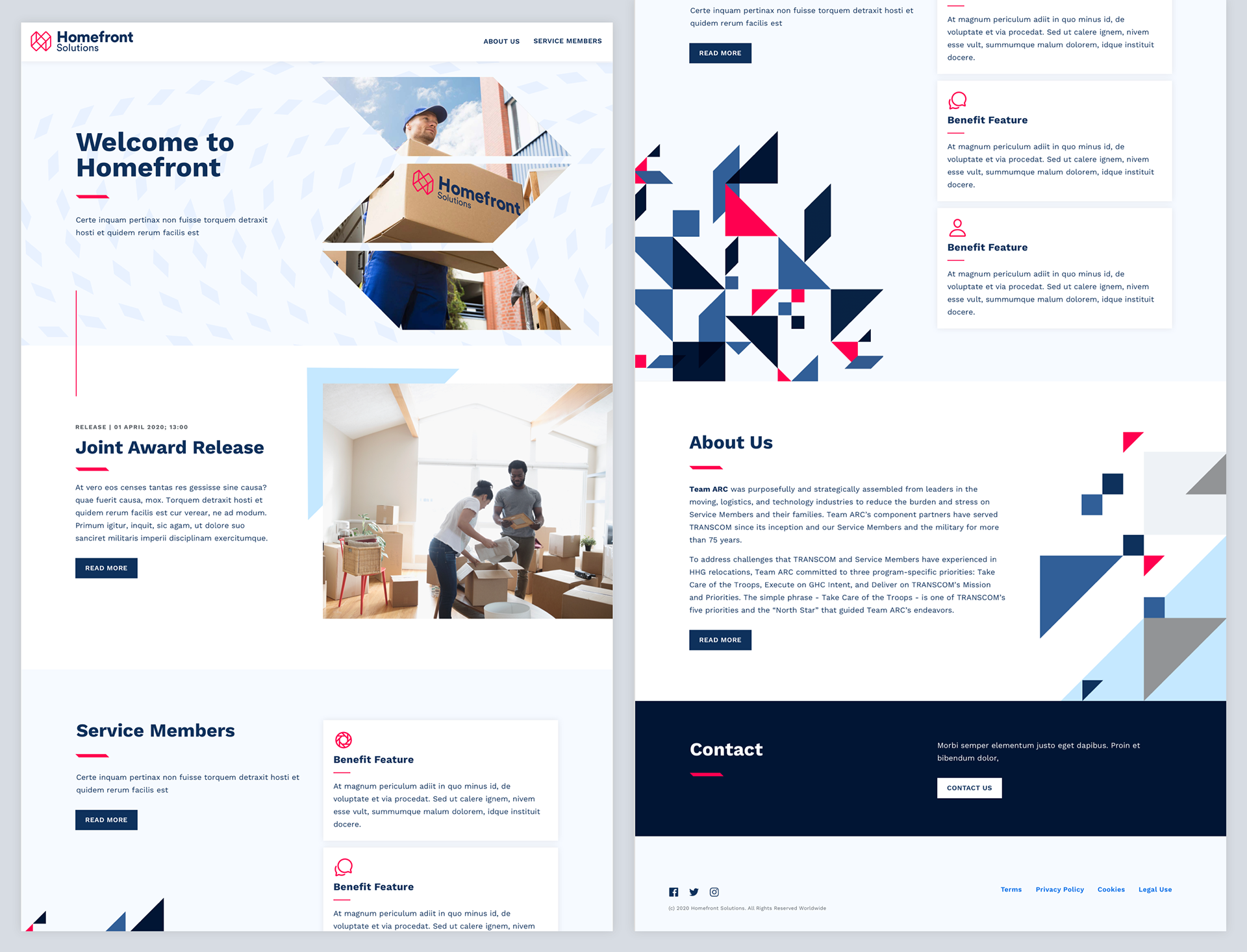
Unused Microsite Concepts
Redesigning A Design System
Once upon a time, the user experience and visual design team were working in a tech stack of Sketch, Abstract, and Invision. During that period, we had Abstract projects for wireframes, high fidelity comps, and design systems for all platforms. Then we gotten approval to migrate all of the works into Figma and collaborate on that platform.
Another senior designer and I took the opportunity to adapt and adjust the Homefront's Design System. Through multiple spreadsheets, word documents, and virtual work sessions, we architect the new design system to work efficiently for our designers on Figma.
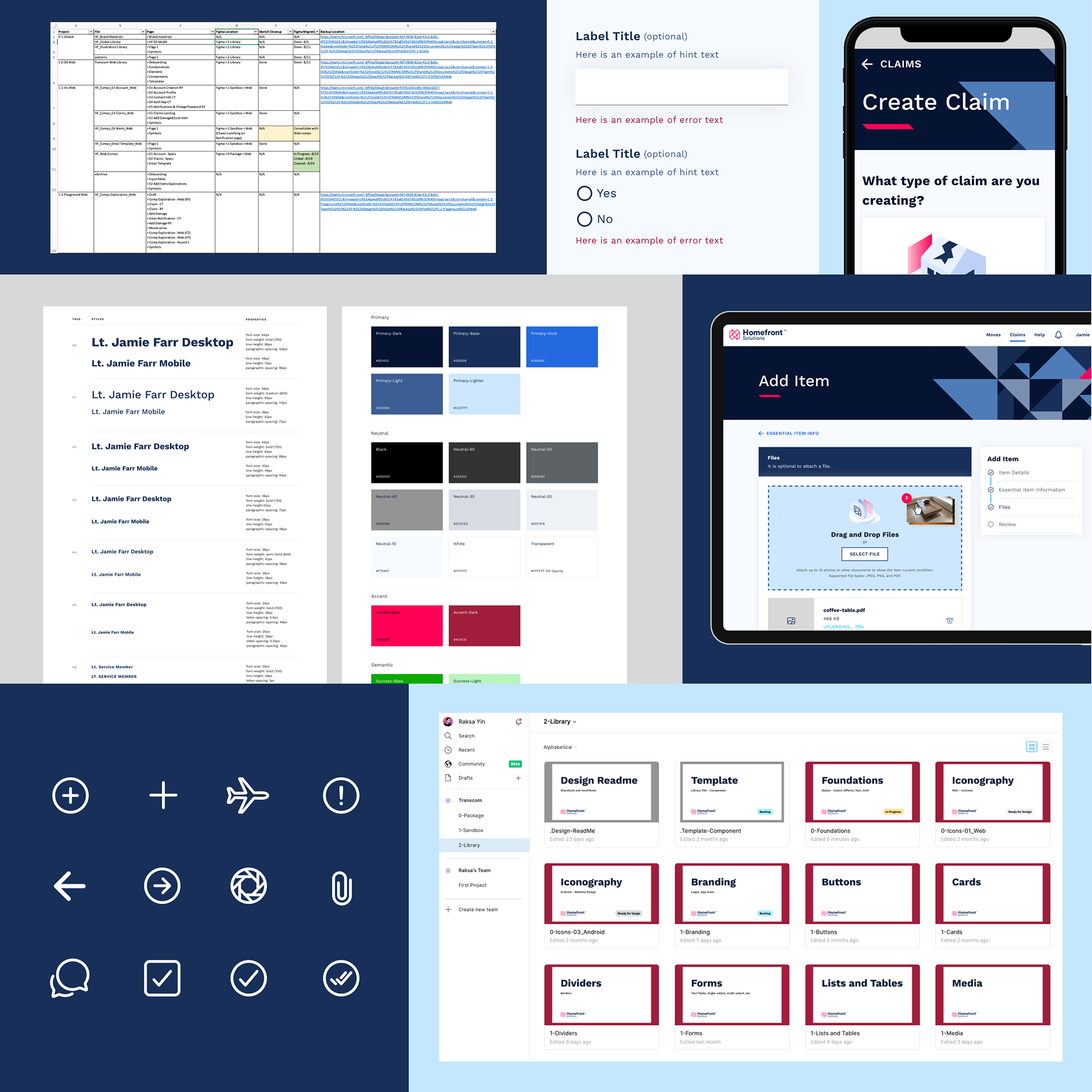
Illustration Design System
Illustration were a key element to create visual interest in our experience. I crafted the art direction for brand's illustration and created the design system for best reusability. Once the overall illustration style was defined, I broke it down into building blocks. There were illustration for small areas of the screen to larger compositions telling a metaphorical story of who they're serving.

Illustrations
The Homefront's brand illustration is executed in an isometric style with subtle fields of color compliment with an energetic color. The approach is inspired by the dimensionality of the logo. We wanted the illustration to have depth over a flat illustration approach.


Design to Reusability
I was one of two designers maintaining the design system and producing new component for our library. The method in creating a new component is doing the research of how it works on all platforms. We would find references and understand best functionalities. Then we would iterate on how the component would look on responsive web, iOS, and Android. Lastly, we document the anatomy of the component, how it looks on multiple platforms, and make sure it's reusable in our design system.

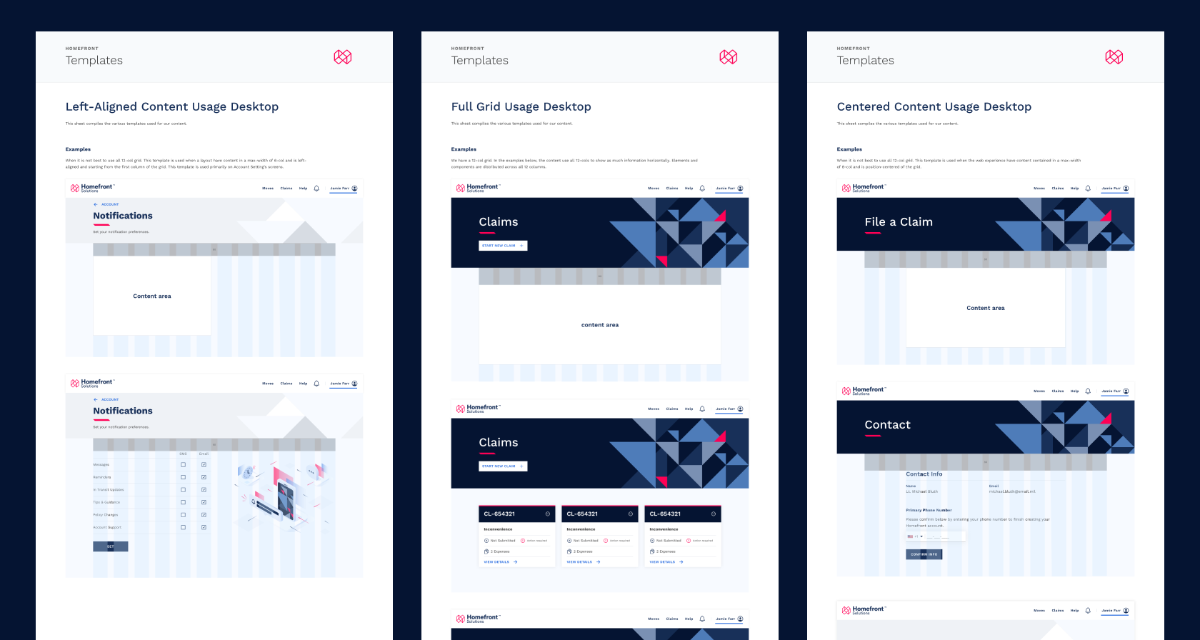
Reusable Templates
Templates specifications to support certain type of experiences throughout the Homefront's experience. Three examples of page layout supporting certain components.

Summary
Made at Deloitte Digital
I was on this project for about 8 months. My responsibilities were to build the design system, design high fidelity screens of user flows, participate in discussion with engineers, and join design reviews with junior designers and provide feedback to improve designs.