Digital Platform Developer
Making at JP Morgan Chase & Co
Working closely with product managers, product designers, content writers, and engineer leads to build a scalable headless content management system that will support multiple lines of businesses.
The design team will provide a reusable design language that comprise of foundational styles, component library, and templates for line of businesses to build for their documentation experience.
Role: Product Design Lead
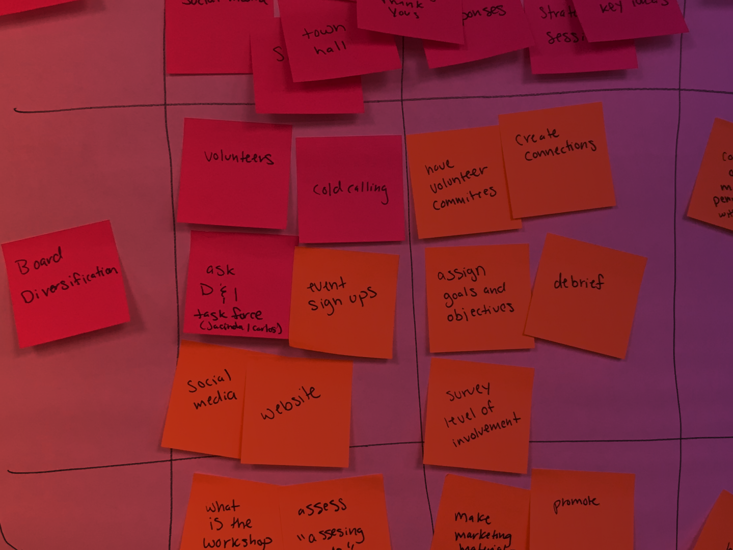
My role is to lead the product design and strategy with three designers under me. I created a product strategy with guiding principles, expected deliverables, and the outcome from the product design team based on understanding customers’ expectations and needs from the platform.
Prior to a sprint cycle, I would specify design task tickets with product management and tech partners for design teams to take on. During a sprint cycle, I distribute the design tasks, set sprint goals, and participate in discussion where design should be include. I review the designers work, provide feedback of where to improve, and include other disciplines when needed.
Tasks: Product Design Strategy, Design System, Sketch to Figma Migration, Project Management, Design Specifications, Web responsive design, Design Quality Assurance, and leading designers.
Project length: July 2021 — June 2022.
Tasks
Product Design Strategy
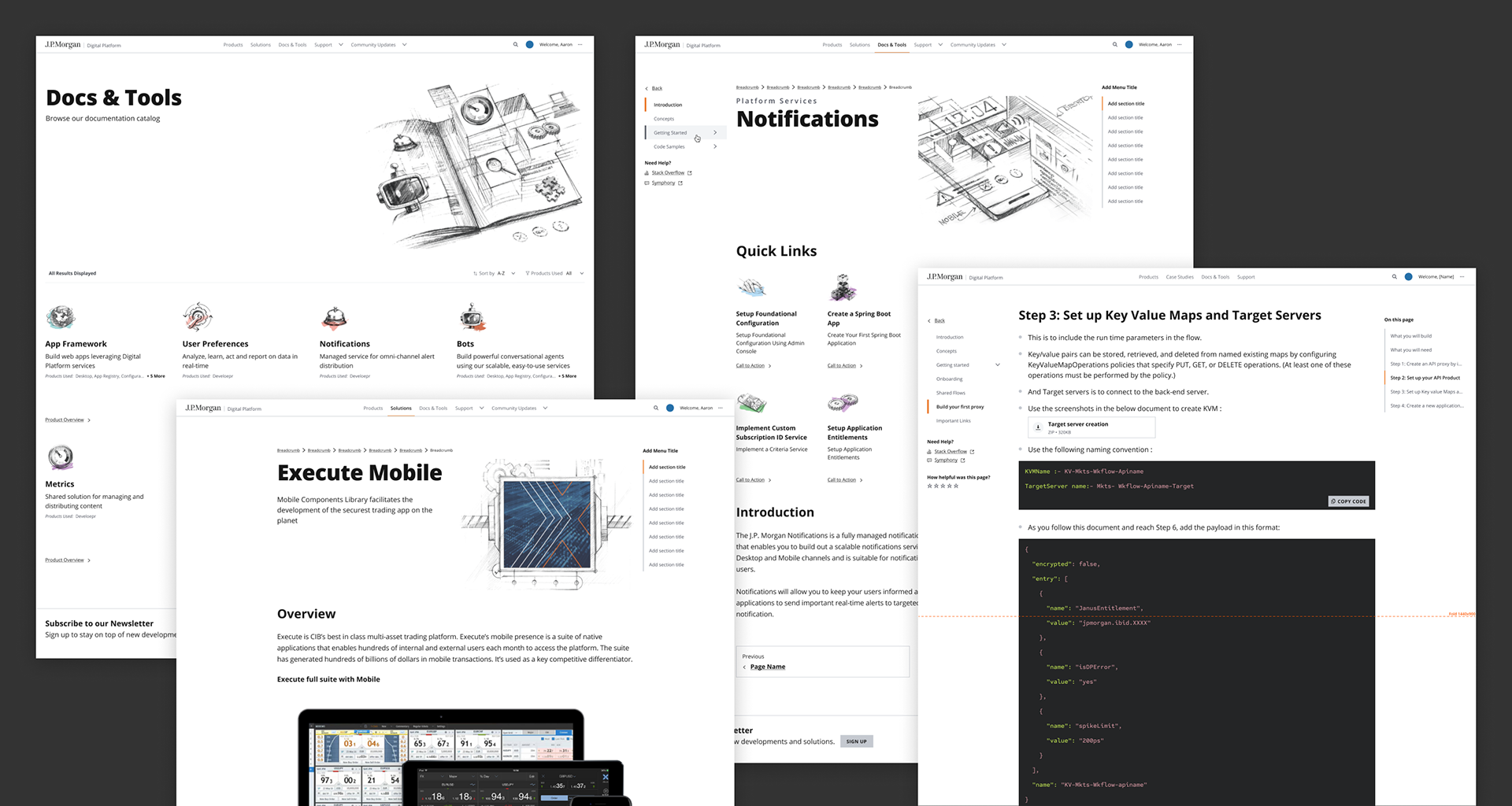
I joined the team during a shift in the organization. Team members were rolling off and new ones were being on boarded. Digital Platform Developer was live for almost a year as an engineering documentation website. Due to its success of reusable templates, components, and marketing capabilities. More lines of businesses want to use it for their engineering documentation.
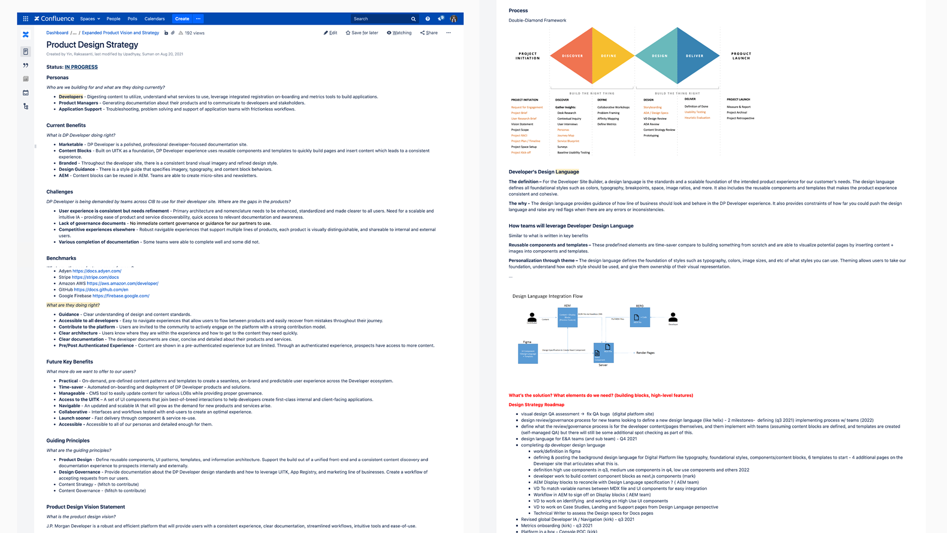
My first task was to create a Product Design Strategy for Digital Platform Developer. It had to state the current benefits, challenges, reference competitors, and list where we are going with this product. I presented to my product managers and development leads and received their buy-in. The document to all members of the team and is the true north for the guiding principles for product design.
Product Goal
Site Building Experience and Theme-able Design Language
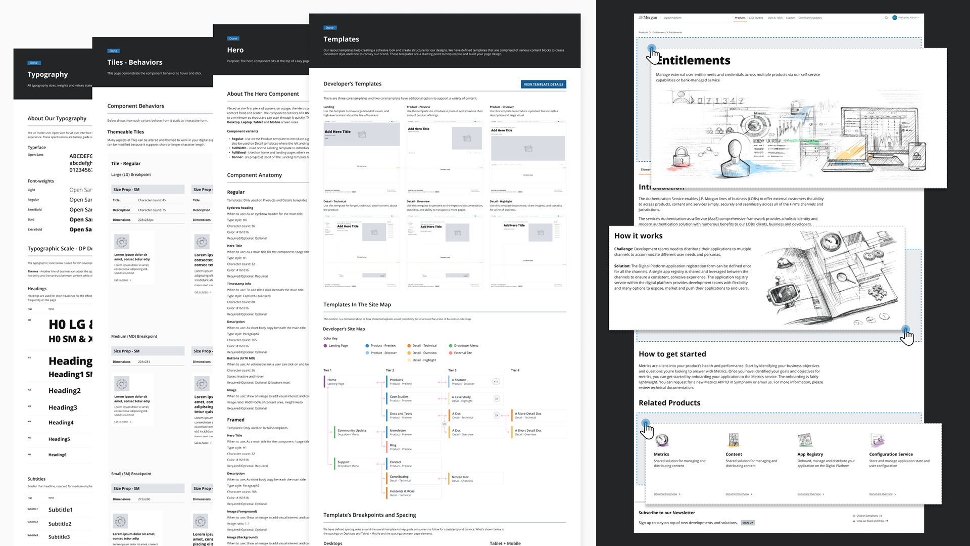
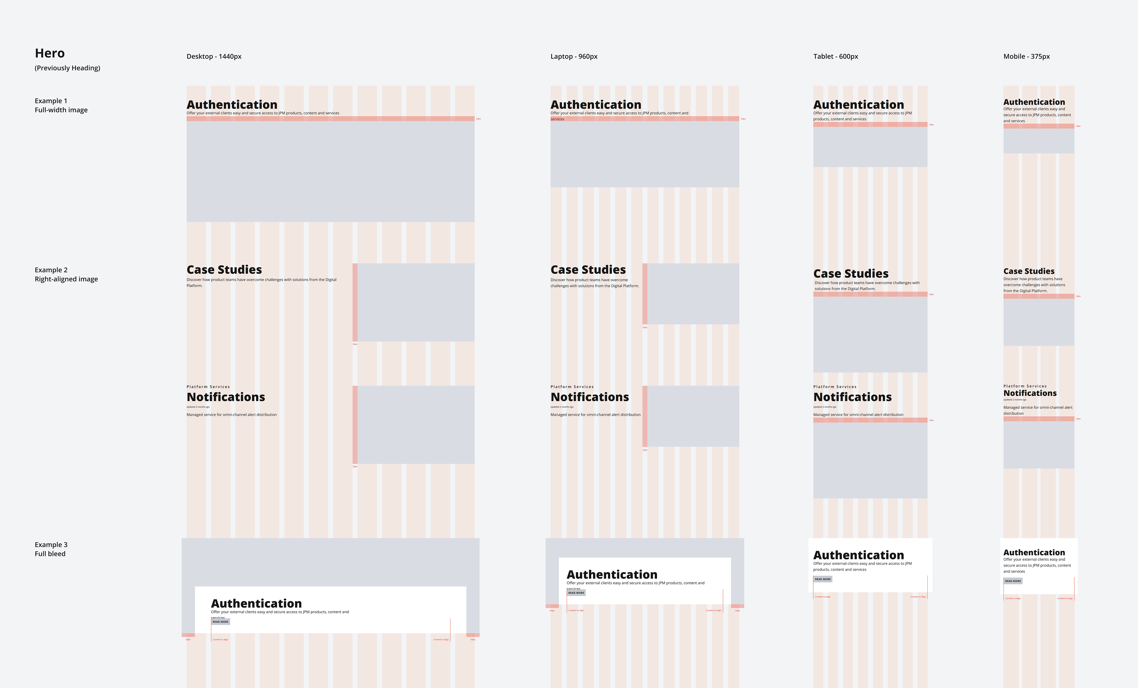
Digital Platform Developer’s Design Language will help teams easily build custom branded developer experiences by enabling them to utilize reusable templates, components, and theme their foundational styles.
We created thorough design specifications that explain the intended styles, interactions behaviors, and how to use the design language’s assets. We ensured the design language can scale through stress testing and then provide design guidance of how to reuse the design language.
Task
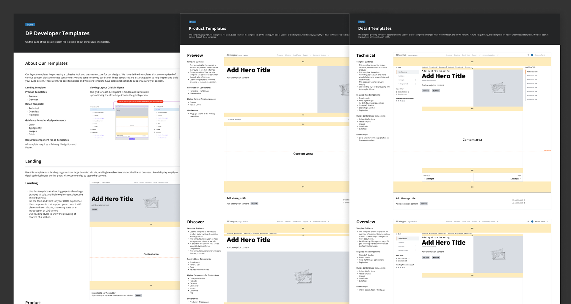
Scaling The Design System
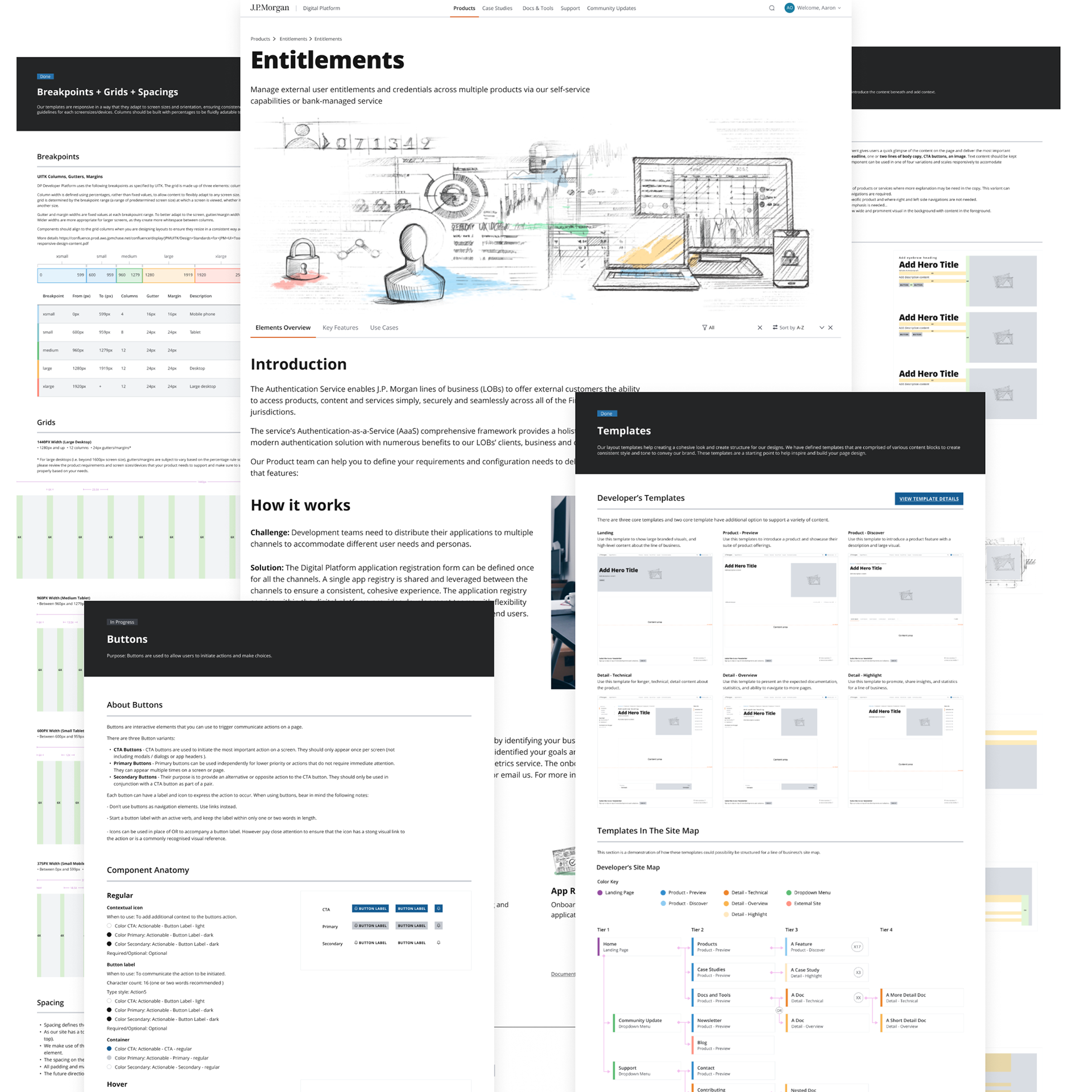
The previous design system was created in Sketch and it was very bare. It was more focused on providing visual references than accompanying them with detailed specifications about components’ intended behaviors.
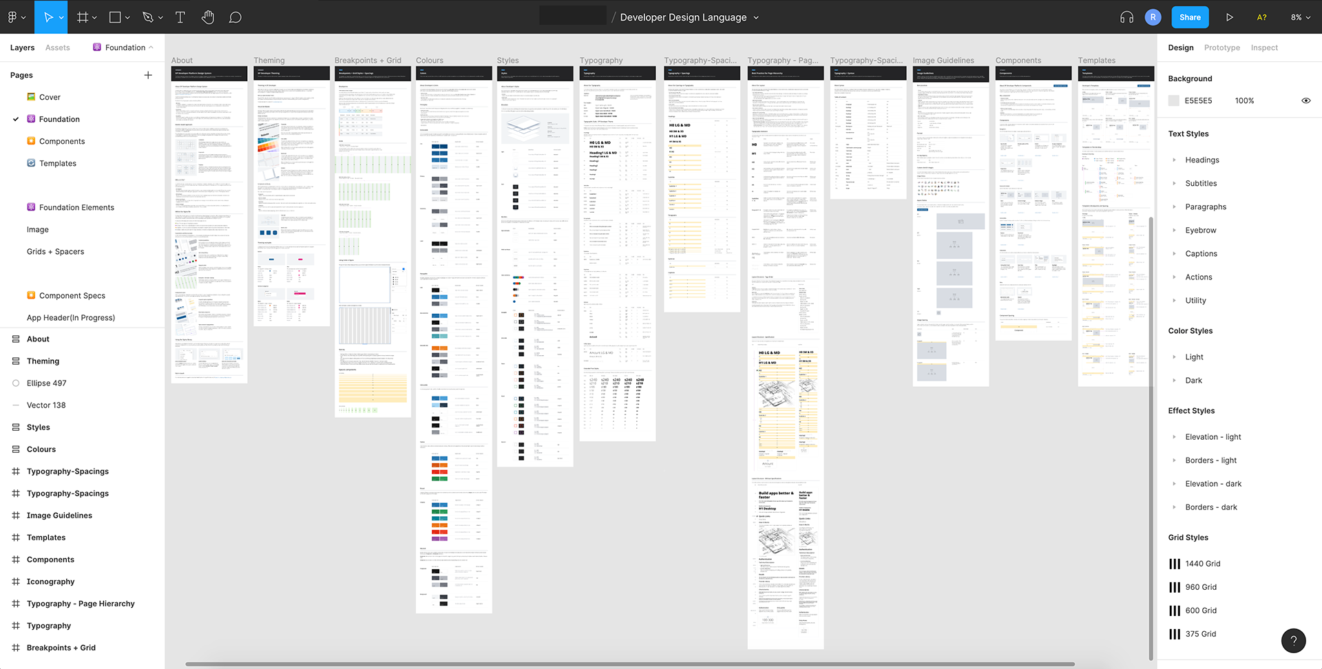
I rebuilt the design system in Figma and improved the design system structure to be more organized and navigable between elements.
I rebuilt the design system in Figma and improved the design system structure to be more organized and navigable between elements.
I revised all of the previous documentation notes and improved them to consider how more lines of businesses could reuse this design system.
Moving forward, Developer’s Design System will become a centralized model where it is the true north for all things foundational elements, components, and templates. There is a future plan to incorporate a slightly federate model to consider contribution from consumers of the design system.
Previous Design Documentation
New Foundation Page
The DP Developer Design System categorizes our atomic elements as
foundations. These are the most fundamental elements to any design system
and are comprised of color, space, typography, iconography, grids, breakpoints and image aspect ratios. They exist as single elements and are grouped together to create components.
Theming Capabilities
Within the design system - theming will allow the modification of universal, visual attributes in order to give individual lines of businesses the ownership of their visual representation through our design language. Alteration of one or some of these visual attributes will result in a new theme which will populate throughout the Design language components.
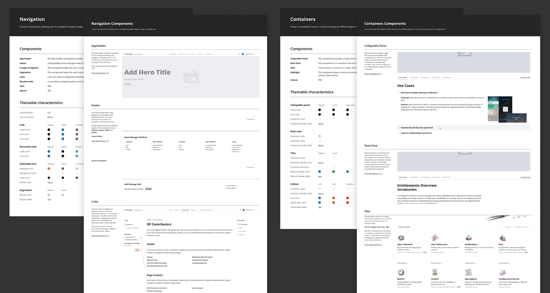
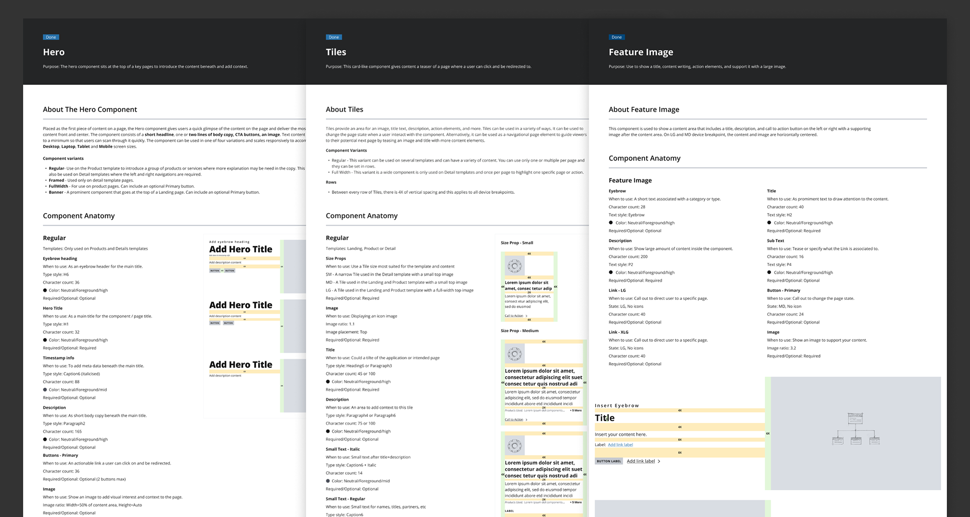
Improved Component Specifications
Components are made up of multiple foundational elements to form an
interactive element whose context is recognizable to the user. On each component pages, there are detailed specifications about their purpose, UI properties, intended behaviors, and guidance to follow.
Task
Documenting Design Specifications
We love using Figma and we give everyone accesses to enter the Figma files to browse around it.
In the spirit of transparency, I wanted to transfer any completed or in-progress work from Figma into Confluence pages for everyone to read.
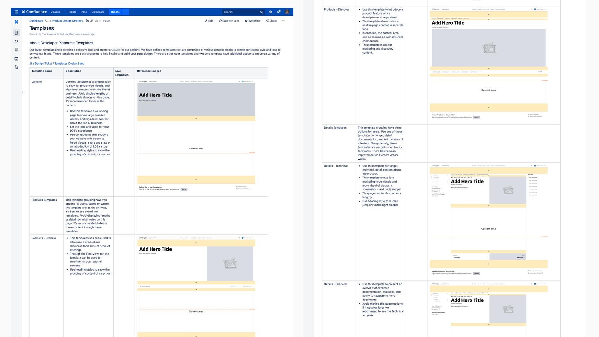
A Unified Experience
Through the design system, many line of businesses can create their own documentation experience with our foundation, components, and templates.